
Blog
Ten Laws to Design By
 Ross Johnson
— Updated May 2023
As designers, we must be aware of our work’s function and design as much as we care about aesthetics and visuals. There are a lot of terms for the design of how the site functions and works, from “usability design” to “user experience,” what remains constant is that if we want to become better designers, we have to pair these two concepts together.
Using clear and compelling design laws as guides, we can use proven formulas for better design. These laws both assist in the experience and aesthetic quality of our designs. Furthermore, referring to and citing these laws when presenting or discussing design can further establish your expertise and justify your design choices.
I’ve identified ten laws that can inform your design process.
1. Hick’s Law
Hick’s law states that with every additional choice, the time it will take to make a selection increases. In short, the more options your website has, the more difficult it will be. This law speaks about the importance of simplicity.
The classic case study for Hick’s law involves a grocery store offering free jam-tasting for customers. In one case, they had 40+ jams to sample and choose from compared to three samples in control. The researchers discovered that customers purchased more jam when presented with a handful of options compared to the forty-plus. Customers opted not to buy jam rather than pick from a large selection.
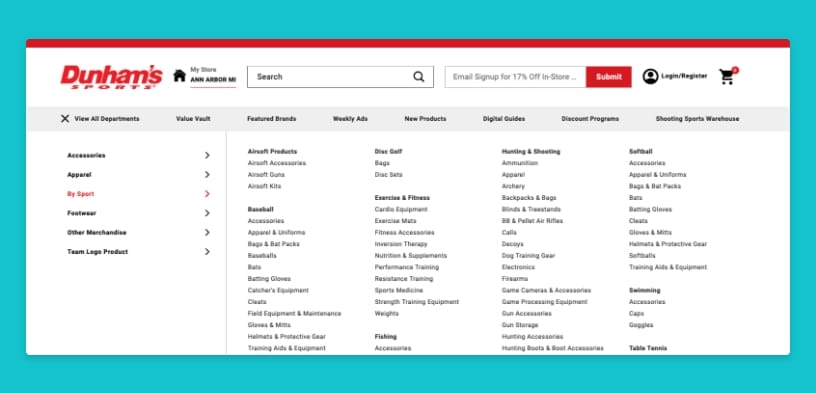
Hick’s law tells us that we should minimize choices where practical. This includes removing non-critical pages, links, buttons, and elements that will make your designs more effective.
2. The Pareto Principal, or the 80 / 20 Rule
The Pareto principle stipulates that 80% of outputs in a complex system are caused by 20% of total inputs. A large percentage of outcomes are caused by a small percentage of inputs (the actual numbers are not always 80/20.) What does this mean for web design? Lots of things.
For one, a low percentage of users will perform a high rate of your desired actions. For example, 20% of all users will make up 80% of your contact form submissions or online purchases. 80% of users selecting from a drop-down field will choose the same 20% of options.
Once you know this disparity, you can identify places to take advantage of it. The most straightforward implementation would prioritize the 20% of options, form fields, pages, links, etc., that get the most activity. Thinking broader, if you can learn about the 20% of high-value users, you can better optimize your design (and marketing efforts) to support their needs, increasing the number of conversions you get from the site.
Read more about the Pareto Principal
3. The Rule of Thirds

The rule of thirds is a method of composing elements visually pleasing and identifying ways that users’ eyes will scan across the page. Photographers have used this principle for years to create more visually interesting compositions.
Note: the Rule of Thirds is not the same as the “Golden Ratio,” which we’ll discuss shortly.
The rule of thirds is used by breaking up a design vertically and horizontally. This builds a grid of intersecting lines. The rule states that a viewer is more likely to be drawn to the intersection of those lines. Additionally, it is a good rule of thumb to place elements along the lines and intersections and avoid placing anything in the dead center of the composition or having a horizon diving the composition in half.
Placing elements to take up 1/3rd or 2/rds of the space will be more visually pleasing to most viewers.
Read more about the Rule of Thirds.
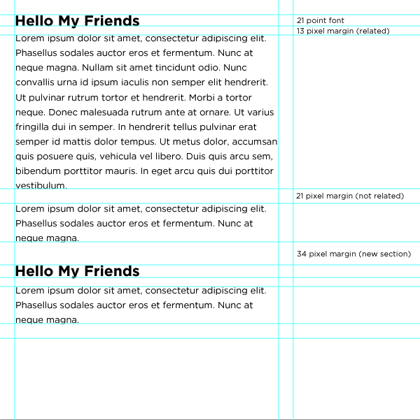
4. Proximity
The law of proximity is often neglected, even by experienced designers. This law states that elements near each other will appear related, and you should be intentional about the placement and spacing of elements in your design.
If you place two elements nearby, users will assume they are related regardless of what they are. Web applications often group controls near each other as a convention, yet sometimes those controls relate to entirely different functionality. A search button equality spaced next to a “save” and “cancel” button will assume a relationship. For example, maybe the search is for looking up a previous version of your work.
Using proximity is not all about avoiding unintentional grouping; it can be used to inform users better as well. Placing headlines closer to their related paragraphs instantly informs users that the text is associated with the content below. You can look at the headlines in this blog as an example.
5. Feedback
Industrial designers are masters of feedback, giving a user a clear indication that something already happening or could happen in the future. Often subtle feedback is the cornerstone of a positive experience. Consider a coffee maker that didn’t have an indicator that it was on, how would you know if you had successfully started the brewing process?
If interaction points don’t have obvious feedback, the user needs to expend mental energy to determine the website’s current state, which takes energy. Adding loading indicators, hover states, focus states, active states, visited link styling, validation/error messages, etc… makes the site more enjoyable.
6. Fitts’ Law

Fitts’ Law states, “The time required to move to a target is a function of the target size and distance to the target.” We can apply this to web design by looking at the hit area of our objects. The larger we can make the clickable area of critical links and navigational elements, the easier they will be to click on. Remember that while as web designers we may be highly proficient at using the mouse and the web, many users still have trouble with these basic functions.
A common misuse of Fitts’ law is when a design is coded so that the menu bar’s text is clickable, but the tabs are not. Rather than just making the text clickable, adding padding to that link element would be a great idea to increase the clickable area. Sometimes this means turning the anchor into a block-level element and wrapping details inside.
This can also work oppositely, meaning items we want to be challenging to click on (such as cancel buttons/links) should have a smaller clickable area. This is why you often see forms or actions that have large “save” buttons but text-based “delete” or “cancel” links. WordPress uses this law extremely well.
7. The Golden Ratio
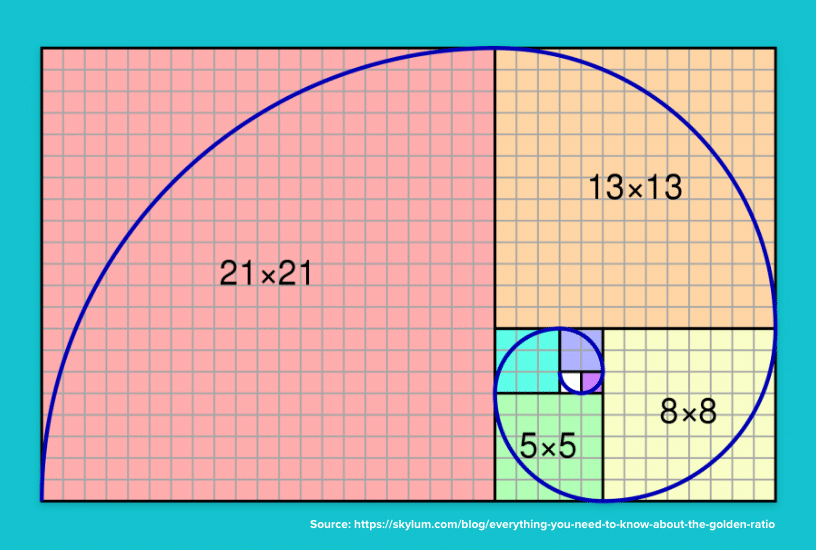
The golden ratio is often confused with the rule of thirds, but make no mistake, they are different. The golden ratio looks at what proportions are naturally most visually appealing. This ratio has been used in design, architecture, and engineering for centuries. It has even been tied to what features we find most attractive in people (facial and body types).
The golden ratio can be described as a ratio within the elements of a form, such as height to width, approximating 0.618.
When applied to rectangles, you can continue to create more minor dissections of the shape using the .618 ratio, which makes a natural spiral pattern. This can be seen in nature by examining sea shells.
This ratio has been used throughout history in everything from the craftsmanship of violins to the design of the Parthenon and Stonehenge.
It is unlikely that some of these items were created with the golden ratio in mind; instead, the creators likely preferred the design’s visual appeal when using these ratios.
Ultimately the golden ratio is more likely to produce visually pleasing compositions.
Read more about the Golden Ratio
8. Occam’s Razor
Occam’s Razor states, “The simplest solution is almost always the best.” With the flexibility and power of the web and our design tools, it is easy to get carried away. The result is a highly complex site or design that may have a lot of functionality and information but is difficult to use, build and maintain. Even though one might think the site can do more, it accomplishes less.
This is commonly an issue where companies need to put everything they can up on the website in the rare case someone wants the information. What gets ignored is that the overwhelming majority of the users will access about 20% of the content on the site (see the 80/20 rule earlier).
Being ruthless about the value that a page or piece of content provides and removing anything that is unnecessary will make significantly more robust and more effective designs.
This rule also speaks to the age-old saying, “A design isn’t finished when there is nothing more to add, but when there is nothing left to take away.” Design simplicity is elegant, sophisticated, and much more effective than the complex decorative style prevalent on the web these days.
9. Fibonacci Sequence
The Fibonacci Sequence is a series of numbers in which each number is the sum of the preceding two. For example, if you started with 1 it would go like this:
1, 1, 2, 3, 5, 8, 13, 21, 34, 55, etc…
This is significant as it has been found in many classical creative works, is found commonly in nature, and is often used in addition to the golden ratio. Patterns based on the sequence are intrinsically aesthetic and, therefore should be used in the composition of our designs.
This sequence can be used to create visual patterns, shapes, organic figures, build grids or dictate sizing and ratios. The Fibonacci sequence is considered to be one of the most influential patterns in both mathematics as well as design.
Read more about the Fibonacci Sequence
10. Mental Models
The Mental Model law states that it is significantly easier for users to understand and learn something new if they can model it based on something they already understand. This is why the concept of tabs works so well and why operating systems are modeled off real-world office situations (folders, files, desktop, etc…)
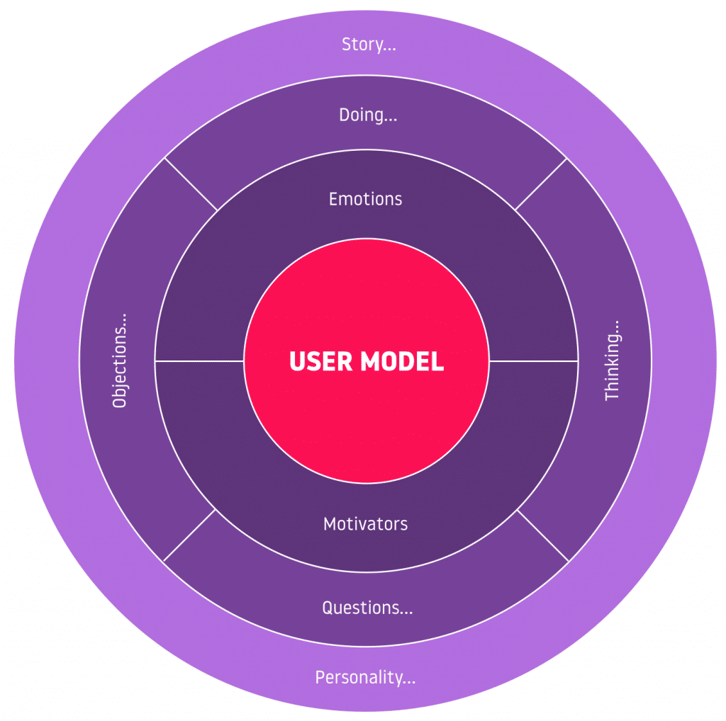
We can use this concept (along with a few other behavior patterns) to make our designs easier and more visually compelling. Sometimes it would be effective to model our designs from real-world situations or objects. Consider designs that mimic desktops, papers, or offices. Users can learn, understand and draw meaning from these types of designs because they can relate them to their understanding of the objects in real life.
Use the Laws, Design Better
Do you use any laws or design principles when crafting your designs? I would love to hear about them. Do you need help making your website or web application more effective using design psychology and science? Contact our web design agency to discuss your web design or user experience design needs.
FREE TOOL: OPTIMIZE YOUR SITE
Grade Your Entire Website in Seconds
Submit your website link and get a detailed report on how you can improve page performance, SEO optimization, mobile usability, and more.