
Blog
10 Examples of Beautiful CSS Typography and how they did it…
Updated Jan 2022
Web typography has evolved significantly over the last 10 years. When I first wrote this article, designers were limited to a dozen system fonts, embedding type as images or using third-party libraries to render different non-system fonts dynamically.
With an abundance of free web fonts and affordable premium fonts from well-known type foundries, web designers have plenty of options for selecting a compelling typeface. There is more to great web typography than picking the right type. However, you need to know how best to present type. In particular, understanding the design patterns and capabilities of CSS in typography.
In this article, we’ll cover 10 examples of beautiful typography and what CSS was used.
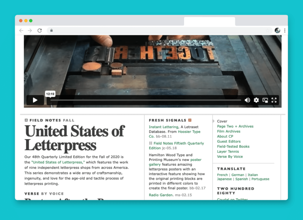
1. Coudal Partners
<div class="example">
     <h3>small headline</h3>
     <h2>Larger Headline</h2>
</div>
h3 {
	font-family: Gill Sans, Verdana;
	font-size: 11px;
	line-height: 14px;
	text-transform: uppercase;
	letter-spacing: 2px;
	font-weight: bold;
}
h2 {
        font-family: times, Times New Roman, times-roman, georgia, serif;
	color: #444;
	margin: 0;
	padding: 0px 0px 6px 0px;
	font-size: 51px;
	line-height: 44px;
	letter-spacing: -2px;
	font-weight: bold;
}
You may be surprised that the serif font used is… *gasp* times new roman! Using a sizeable bold version with negative letter-spacing (-2px) the nuances of the font really create some unique whitespace and relationship with each other. Not using a solid black creates an exquisite look and feel.
The smaller headlines above it are all caps with moderate letter-spacing (2pixels) and are either gill sans or Verdana, both clean san-serif fonts. The proximity of the two different typefaces and the tension between the moderate letter-spacing and the negative letter-spacing creates a wonderful typography composition. The tight line height (44px for a 51px font) creates close interaction between the ascenders and descenders of the type.
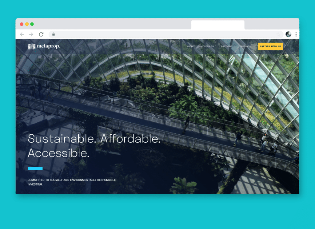
2. Meta Prop
<div class="example">
     <h1>Sustainable. Affordable. Accessible</h1>
     <h2>Committed to socially and enviornmentally responsible investing.</h2>
</div>
h1 {
        font-family:SpaceGrotesk-Light;
	color:#fff;
	line-height: 1.2;
        font-weight: 500;
        font-size: 64px;
        margin-bottom: 40px;
}
h2 {
        font-family:SpaceGrotesk-Medium;
        max-width: 520px;
        text-transform: uppercase;
	color:#fff;
	font-size: 16px;
}
The metaprop website leverages SpaceGrotesk, a beautiful and geometric typeface to communicate the brand’s forward-thinking and technology-focused culture. The contrast between the large and thin heading, to the small, all-caps sub-heading creates beautiful interplay and dynamic contrast.
This is a great example of how beautiful typography doesn’t need to be complicated, simply having ample contrast, thoughtful type selection, and variation in type treatment can be enough.
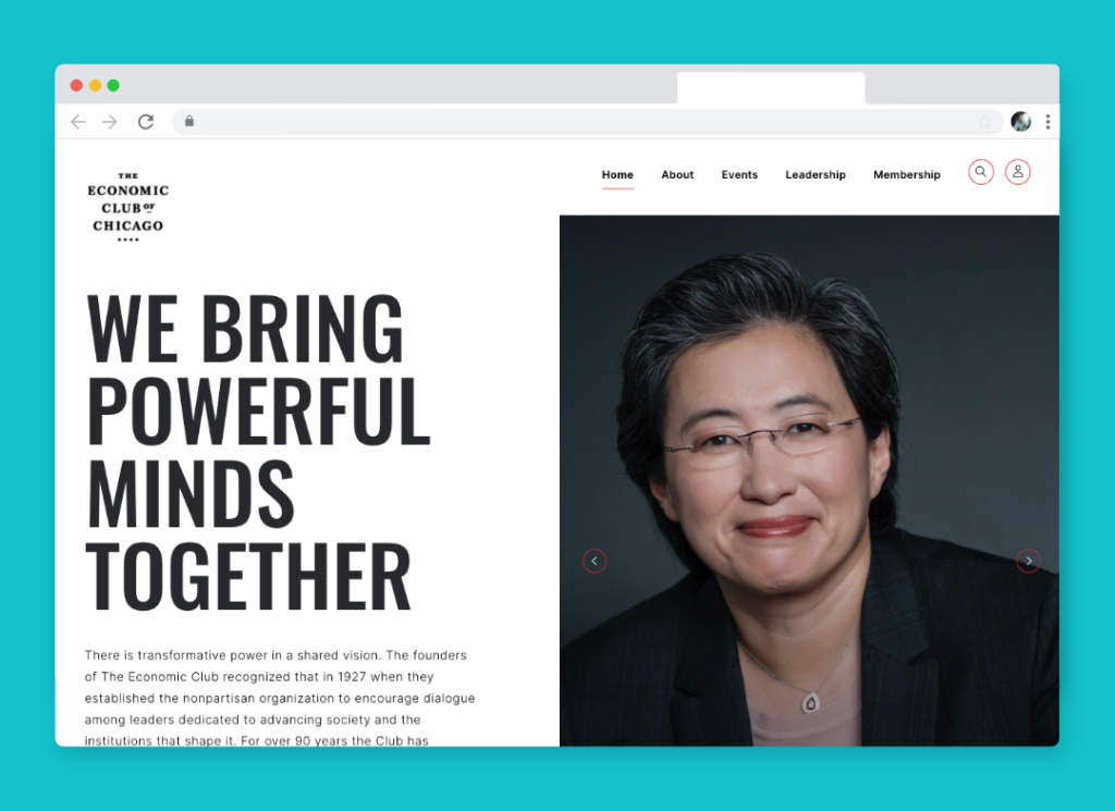
3. The Economic Club of Chicago
<div class="example">
     <h1>WE BRING POWERFUL MINDS TOGETHER</h1>
     <p>There is transformative power in a shared vision. The founders of The Economic Club recognized that in 1927 when they established the nonpartisan organization to encourage dialogue among leaders dedicated to advancing society and the institutions that shape it. For over 90 years the Club has maintained that legacy and today we remain committed to connecting Chicago’s top business and civic leaders to the people and ideas impacting our city, the nation and the world.</p>
</div>
h1 {
     font-family: oswald;
     font-size: 108px;
     font-weight: 500;
     text-transform: uppercase;
     line-height: 1;
}
p {
     font-family: Inter;
     letter-spacing: 0.55px;
     font-size: 16px;
     line-height: 28px;
}
The Economic Club of Chicago expertly leverages clean typography and bold typographic contrast. The heading is approximately seven times larger than the body copy, drawing your eye immediately into its most crucial message before it naturally falls to the long-form content below.
I love that this website uses two very popular and arguably overused fonts (Oswald and Inter,) but does so in a way that feels completely unique. The all-cap heading uses a light line-height to add tension and impact, and for the body type, they’ve added just a touch of letter spacing (0.55px) to add whitespace and improve legibility. They’ve arrived at a reasonably standard line-height for the body type at approximately 1.6, which gives enough whitespace to not feel cluttered without having significant gaps between lines.
Grade Your Entire Website in Seconds
Submit your website link and get a detailed report on how you can improve page performance, SEO optimization, mobile usability, and more.
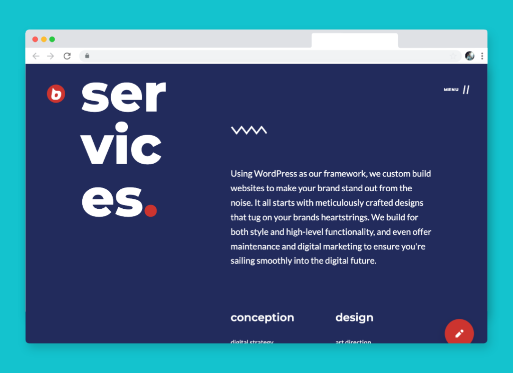
5. Buzzworthy
<div class="example">
     <h2><span class="seg">ser</span><span class="seg">vic</span><span class="seg">es<b>.</b></span>
     <p>Using WordPress as our framework, we custom build websites to make your brand stand out from the noise. It all starts with meticulously crafted designs that tug on your brands heartstrings. We build for both style and high-level functionality, and even offer maintenance and digital marketing to ensure you're sailing smoothly into the digital future.</p>
     <h3>conception</h3>
</div>
h2 {
     font-family: 'Montserrat';
     font-weight: 800;
     line-height: 1em;
     font-size: 200px;
     color: #fff;
}

h2 span.seg {
    display: block;
}

h2 span.seg b {
   color: #D6372E;
}

h3 {
   font-family: 'Montserrat';
   margin-top: 4em;
   font-size: 30px;
   line-height: 1.1em;
   font-weight: 600;
}

p {
   line-height: 1.66em;
   margin: 0;
   font-family: 'Lato';
   font-size: 24px;
}
There are lots to love about the typography and use of CSS on the Buzzworthy website. The bold and decorative section headings split between multiple lines, to the well-proportioned and clean body type. There’s both extreme and nuanced contrast within their typography. You immediately are drawn to the section headline because of it’s size and treatment, then naturally consume the section content without having to dart your eye back to the heavest element on the page.
They’ve split the heading using span elements and display:block; While simple, it creates an unexpected and uncommon way of indicating the topic of the section. When it comes to the body type, their is only subtle contrast between the heading and paragraph type (the heading is approximately 25% larger.)
They’ve used two very common fonts, Lato and Montserrat, but the treatment makes the typography unique and stand-out.
5. Airbag Industries
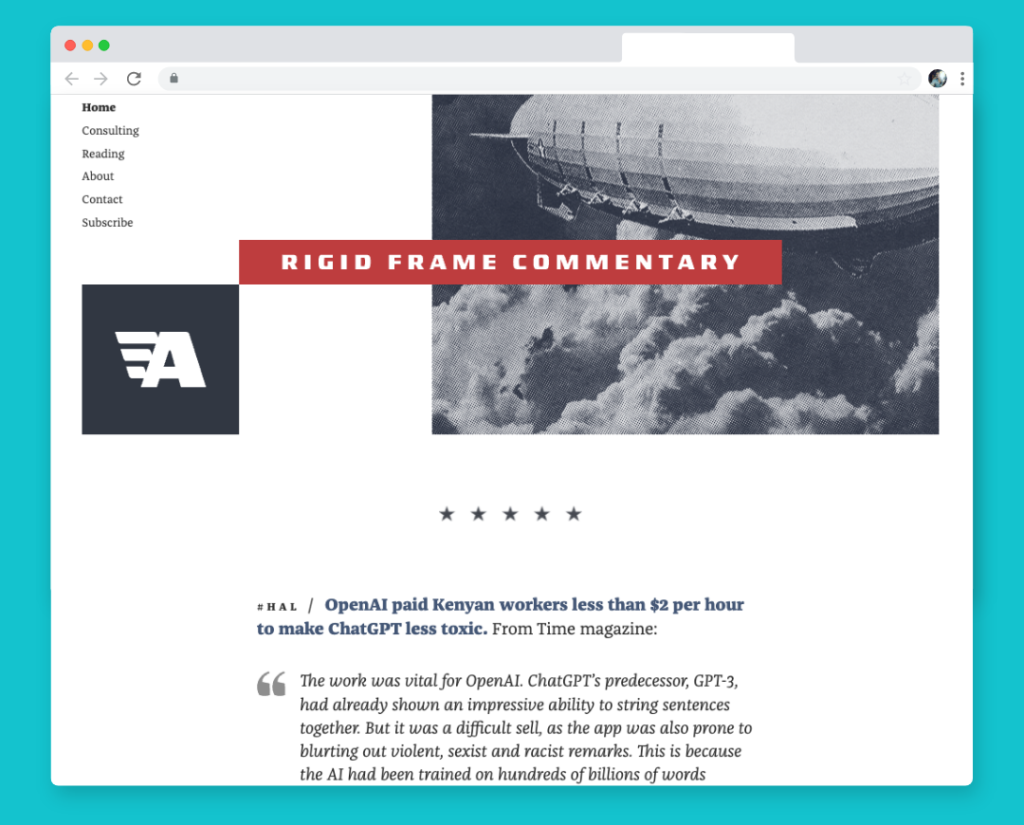
<div class="example">
     <h2><span class="hashtag">#hal /</span> <strong>OpenAI paid Kenyan workers less than $2 per hour to make ChatGPT less toxic.</strong> From time magazine:</h2>
     <blockquote>
     <p>The work was vital for OpenAI. ChatGPT’s predecessor, GPT-3, had already shown an impressive ability to string sentences together. But it was a difficult sell, as the app was also prone to blurting out violent, sexist and racist remarks. This is because the AI had been trained on hundreds of billions of words...</p>
</blockquote>
</div>
h2 {
     font-weight: 400;
     color: #333;
     font-size: 19px;
     font-family: 'Franziska, Georgia, Cambria';
}

h2 span.hashtag {
     text-transform: uppercase;
     letter-spacing: 4px;
     color: #333;
     font-weight: 400;
}

h2 strong {
    color: #4B6082;
    font-weight: 800;
}

blockquote {
    font-style: italic;
    padding-left: 3rem;
    font-size: 19px;
    line-height: 26.22px;
    font-family: 'Franziska, Georgia, Cambria';
}
Airbag Industries has a beautiful array of typographic elements driving the tone of its website. The interplay between different weights, letter spacing, colors, and sizes create a dynamic rhythm without feeling disjointed. This is accomplished by using a single typeface and relatively little contrast between type sizes. The headings and body type are close in size, primarily differentiated through color and weight. Accent type is noticeably smaller, but uses ample letter spacing to differentiate it from the primary content.
This website is a perfect example of less is more, and how the nuances of typography can lead to a beautiful, legible, and type forward design that looks simple, but is difficult to pull off.
6. Catholic Trojan
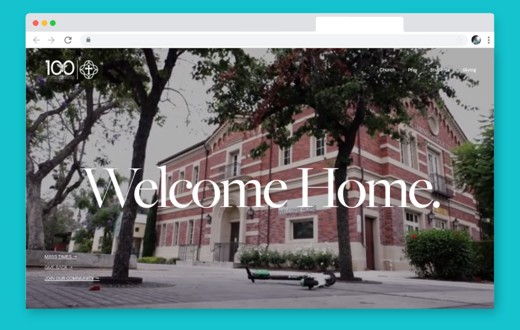
<div class="example">
     <h1>Welcome Home</h1>
     <ul>
          <li><a href="#">Mass Times</a></li>
          <li><a href="#">Give Back</a></li>
          <li><a href="#">Join Our Community</a></li>
     </ul>
</div>
h1 {
   color: #fff;
   font-family: 'freight-big-pro';
   font-size: 201px;
   font-weight: normal;
   letter-spacing: -6.5px;
   overflow-wrap: break-world;
}

ul {
   list-style: none;
   margin: 0;
   padding: 0;
}

li {
   margin: 0 0 8px 0;
   padding: 0;
}

li a {
   color: #fff;
   font-size: 15px;
   font-family: runda;
   text-transform: uppercase;
}
The Catholic Trojan website leverages large, bold serif type to communicate short but impactful messages, contrasted by simple, clean and modestly sized san-serif body type.
The large heading type accents the nuanced and beautiful serif typeface they’ve chosen with dramatic strokes and energetic italics. I love that they’ve used negative letter spacing to pull the letter forms together to the point where one letter flows into the next, it creates both visual tension and connection.
This website proves that rules about limiting the number of typefaces and treatments can be ignored if you know how to use contrast, balance, and whitespace.
7. Greenhouse
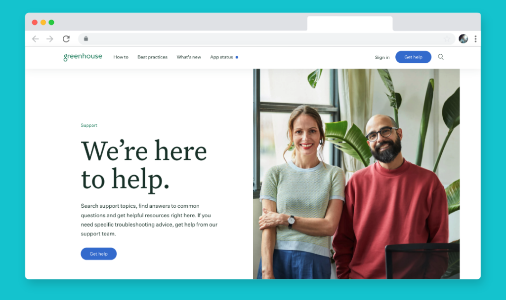
<div class="example">
     <h5>Support</h5>
     <h1>We're here to help.</h1>
     <p>Search support topics, find answers to common questions and get helpful resources right here. If you need specific troubleshooting advice, get help from our support team.</p>
</div>
h5 {
    font-size: 15px;
    font-family: 'Untitled Sans';
    font-weight: 400;
}

h1 {
    font-family: 'Untitled Serif';
    font-size: 100px;
    line-height: 98px;
    font-weight: 400;
}

p {
   font-family: 'Untitled Sans';
   font-size: 19px;
   font-weight: 400;
   letter-spacing: -0.20px;
}
The Greenhouse support website does an exceptional job creating visual interest through size, color, spacing, and type style. They’ve selected an expressive, yet clean serif font for their large hero type (100px!) and generated balance by using a simple, no-nonsense typeface for the body at a much smaller size. The eyebrow (Support) is about 25% smaller than the body copy, enough that you notice the label but quickly skim over it.
I love that they’ve applied a tiny amount of negative letter spacing to the body type to pull letter forms ever so slightly together to improve legibility.
8. I love Typography
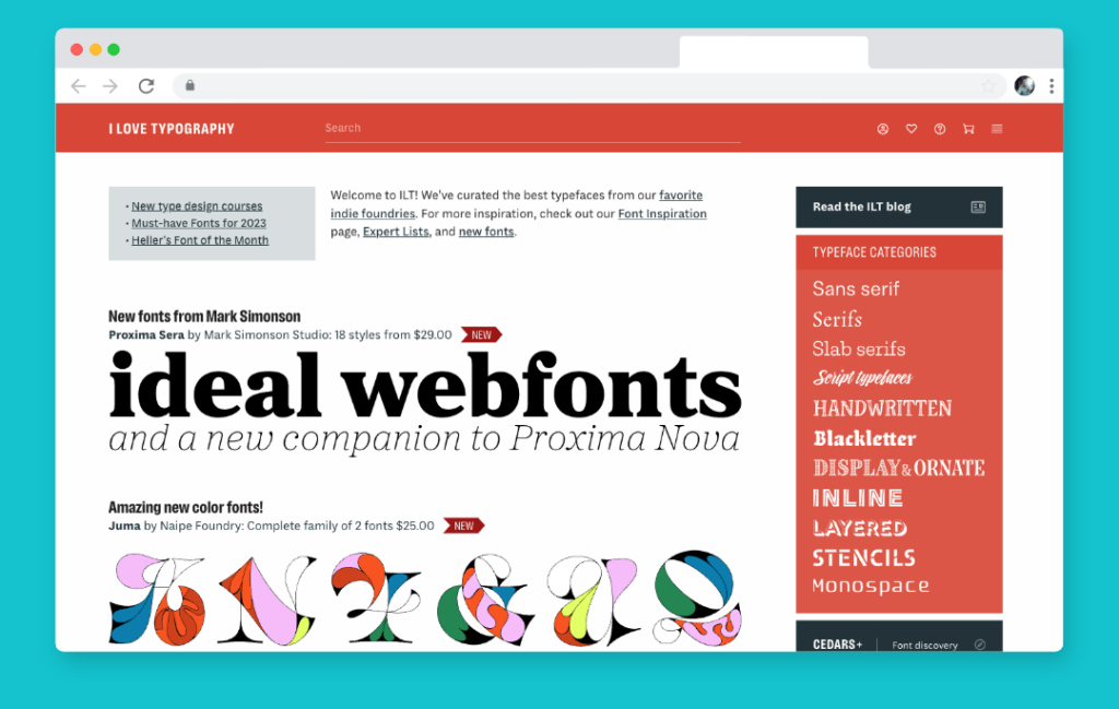
<div class="example">
     <div class="ilt">
          <h2>Sunday Type: Ale Paul type</h2>
          <p>In the Beginning</p>
     </div>
</div>
HEADLINE
        font-family: Georgia, "Times New Roman", Times, serif;
        font-size:24px;
	margin-top: 5px; margin-bottom: 0px;
	text-align: center;
        font-weight: normal;
        color: #222;

SUBHEADLINE
        font-family: "Lucida Grande", Tahoma;
	font-size: 10px;
	font-weight: lighter;
	font-variant: normal;
	text-transform: uppercase;
	color: #666666;
        margin-top: 10px;
	text-align: center!important;
	letter-spacing: 0.3em;
“I love typography” proves that the site owner is not kidding with some beautiful headlines (and beautiful CSS type all over the site). In the case of the headlines, the real attractive and elegant CSS typography is the subheadline. Contrasting Georgia with Lucida Sans, a very clean san-serif font (especially when it is all caps) is a subtle way to display class through type. The generous letter spacing really emphasizes each and every form of the sub-headline, creating both visual interest and visual communication.
9. Craft CMS
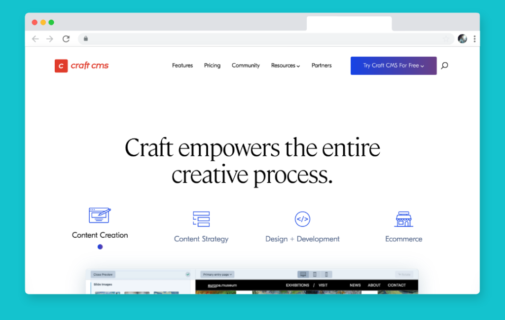
<div class="example"> <div class="thebignoob"> <p><strong>May 8, 2008</strong></p> <h2>HOW Now Conference Cow</h2> <p>HOW you get to Boston is up to you. WHO and WHAT you do while here — that is the question.</p> <p> </p> </div> </div>
DATE
      font-size: 85%;
      text-transform: uppercase;
      letter-spacing: 1px;
      color: #bbb;
      font-size: 10px;
      font-family: "Lucida Grande", Verdana, Helvetica, Arial, sans-serif;
      font-weight: 100;

HEADLINE
        font: bold 34px "Century Schoolbook", Georgia, Times, serif;
	color: #333;
	line-height: 90%;
	margin: .2em 0 .4em 0;
	letter-spacing: -2px;

TAG
        color: #76879b;
        font-size: 10px;
        margin: 5px;
        font-family: "Lucida Grande", Verdana, Helvetica, Arial, sans-serif;
        font-size: 11px;
“The Big Noob” is no noob when it comes to typography… OK bad jokes aside, here is another great example of contrasting ultra clean, small, generously letter-spaced san-serif fonts, with tighter and larger serif fonts for headlines. In this case the designer applied ample letter-spacing to the date of the headline, negative letter spacing to the headline, and left the snippet from the post in the middle. Because of the alteration of color, whitespace, and font size the whole composition ends up very balanced and visually stimulating.
10. The Next Rembrandt
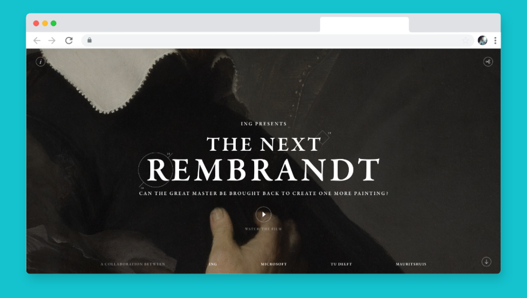
<div class="example"> <div class="qui"> <h2>QUIPSOLOGIES, A DIVISION OF UNDERCONSIDERATION,<br>IS BENT ON KEEPING THE DESIGN COMMUNITY<br>AWARE OF AS MANY THINGS AS POSSIBLE<br>THROUGH AN EVER-GROWING CLUSTER OF CREATIVE<br>MORSELS FOUND ON- AND OFF-LINE.</h2> <h3>No. 4</h3> <p>"Dr. Fredric J. Baur was so proud of having designed the container for Pringles potato crisps that he asked his family to bury him in one." Enough said. [Via Unbeige]</p> <p><span class="qp1">QUIPPED BY Armin</span><span class="qp2">Jun.02.2008</span></p> </div> <p> </p> </div>
HEADLINES
          font-family:georgia, serif;
	  color:#381704;
	  font-size:10px;
	  letter-spacing:0.1em;
	  line-height:200%;
	  padding-top:11px;

NUMBER
          font-family:georgia, serif;
	  color:#3B200F;
	  font-size:16px;
	  font-weight:bold;
	  line-height:125%;
	  text-align:center;

QUIPPED SECTION
          font-family:georgia, serif;
	  color:#786E69;
	  font-size:10px;
	  font-weight:bold;
	  letter-spacing:.1em;
	  text-transform:uppercase;
	  padding-bottom:3px;

 	  font-family:georgia, serif;
	  color:#786E69;
	  font-size:10px;
	  font-weight:bold;
	  font-style:italic;
	  letter-spacing:.1em;
	  padding-bottom:35px;

PARAGRAPH

        font-family:georgia,serif;
	color:#381704;
	font-size:12px;
	font-weight:normal;
	line-height:150%;
	padding:0px;
Quipsologies finds new and interesting ways to use type all over their site. The great thing is, they stick to one typeface yet make it work for so many different situations. The headline section has ample use of letter-spacing in conjunction with a very wide line-height (200%!). The smaller sized all caps make it easy to read and engaging.
The bolder and larger numbers on the site stick out highlighting the items that have been “Quipped,” really pointing you towards the main reason for the sites existence. The headline previous is more of a general description to be read once to understand, then never again.
The copy text is clean and easy to read due to plenty of line height and Georgia as the typeface.
Finally, the quipped section is a lighter brown to take the focus and emphasis off of the element, with a contrasted bold / italics and some mild letter-spacing for a tad extra breathing room.
Done!
It’s been said that the web is 90% type. While designers use color, shape, and imagery to accent websites, much of the content we consume is written. Websites with strong typography need less decoration to best present their content because the content itself becomes the design.
I hope the examples above will give you inspiration on how you can improve the typography of your websites, and how to implement great typography through CSS. If you’re looking for a web design company to help elevate your website’s typography, please reach out.
FREE TOOL: OPTIMIZE YOUR SITE
Grade Your Entire Website in Seconds
Submit your website link and get a detailed report on how you can improve page performance, SEO optimization, mobile usability, and more.