
Blog
12 websites that slide and scroll with javascript
There has been a new trend in standards based design over the last year. The effect seems to have originally appeared in flash websites some time before, but with the use of javascript and a few good libraries people have found out how to do it while still using semantic XHTML/CSS.
The effect is what I call, “The Slider.” Instead of normal navigation where you click on a link and it takes you to another page, or even dynamically loads content onto the existing page, The Slider scrolls you to a different portion of the same page automatically. Sometimes this is simply scrolling down the page to the next content block (in a slow manor rather than an instant jump). Other times people have it scroll to another portion of the page that is not in a vertical manor, maybe 4000 pixels to the right and 500 upwards. The effect being the feeling of traveling to a different portion of the page itself. Lastly some have content scroll with in the content, so rather than the whole page moving the content with in a content block my scroll in and out.
Hotel Oxford
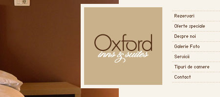
Hotel Oxford is the first site that I had seen doing this. While the page remains stationary, the content with in the design scrolls depending on what page you click on. The fact that every page has hard borders creates a very cool effect.
Team Viget
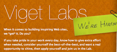
This is the second site I had ever seen doing this effect. Unlike hotel oxford Team Viget scrolls the whole window, creating a sense of moving down a hallway and looking up and down at the different postings on the wall. Very cool effect, and really transforms the website into something more.
Danny Blackman

Danny’s portfolio site is the last type of Scoller that I have come across. His site doesn’t hide any scroll bars, and you could navigate the site normally, but he empowers you to “Save That Scroll Finger” and click on his links which auto scroll you past some very cool illustrations to the next portion of the site.
More LLC
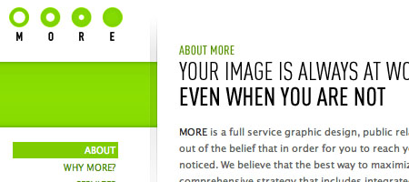
More is similar to Danny Blackmans, in that his site scrolls downward and allows you to manually scroll if you wish. However he added an extra touch by applying a fixed position transparent PNG at the bottom that makes the site look like it is fading into the page. Nice touch.
Brian Katzel
Brian seems to be a very creative individual, seen through his designs and through his use of scrollers, background images, and transparent foreground images. While his page his another site that scrolls vertically, and doesn’t force you to auto scroll, he uses transparent images laid over a bright background image to make paint look like it is running down the page, changing shape, going through tunnels, and well…. you just have to see it because it is genius.
Melissa Hie

Melissa’s site scrolls the entire page, much like Viget. Each block of content is a different color creating a very cool effect when traveling from one to another. An interesting use of no-navigation, Melissa has you quickly bounce around here entire site one step at a time. First seeing what work she has done, then learning about her, and finally getting to her contact “section.”
Volll
Volll takes an interesting approach to the Slider type site. They have the site laid out very much like earth. The bottom of the page is deep under water, the bottom of the ocean. The top of the site is outer space. Where you start is right on land, looking over the water. As you navigate the site you are taking further into the sky or deeper under water. Creative.
Sroown
Scroown is a manual scroll down site, but there is a “back to top” scroller that lazily follows you as you get further down the site. While not the most scrolly type site, the use of typeography and fun scroller make it worth admiring.
Lucuma

Lucuma has fixed elements of the site, yet the content scrolls horizontally. It creates a letterbox effect and is quite dramatic.
Qlear

Qlear only scrolls very specific portions of the content, like the text at the top of his page or his portfolio section. It is a very visually interesting way to get a lot of information across easily. I would say this is one of the most effective ways that I have seen this effect done to communicate content.
NoFrks Design
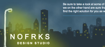
NoFrks Design combines some of the elements we have seen in sites previous. Not only do the use the website as a space that mirrors the natural space (sky, ground, etc) but it also scrolls both horizontally and vertically. Look at their offers and you are scrolled down a highway to read a billboard, but click on their contact information and you are sent to the stars to read more.
3.7 Designs
Yeah I am gonna plug my company site. Much like Qlear we decided to scroll content with in a window, so that messages could be communicated with out going to multiple pages. We did break the site up into more pages that most sites of this style do, however we felt that was the most effect way to reach all of our website goals.
Bonus (13) Engage Interactive
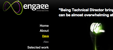
Engage Interactive cleverly shifts the inside content both up, down, left, right, side to side… but keeps the frame of the site static. It creates a very cool look, giving the impression that content is just a step or two away. It makes the site quick and easy to navigate and find new content, no need for excessive page loading times or server queries. A very nice bonus!
FREE TOOL: OPTIMIZE YOUR SITE
Grade Your Entire Website in Seconds
Submit your website link and get a detailed report on how you can improve page performance, SEO optimization, mobile usability, and more.