5 fonts I wish would die
April 14, 2008 @ 1:02 pm | Comments (67) | by Ross Johnson
I don’t claim to be the utmost expert in typography, as much as I love the subject. Beautiful typefaces seem to be an acquired taste, much like scotch or good whiskey. But like scotch and whiskey, there are reasons to get that bottle of crappy $7 bottom shelf stuff out of the cabinet.
Despite my understanding of the need, on occasion, to use obnoxious typefaces; there are some fonts that are ass ugly and show up all over the place. I wish these fonts, could be removed from existence with out exception.
1. Papyrus

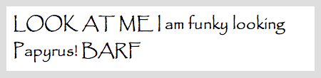
Why does everyone feel the need to use this font for everything? Ok, I get it, you people don’t notice the elegant differences between different modern or classic typefaces… but there is no need to use this font for every situation. I have seen it used for housing developments, ski resorts, massage therapists, cellular stores, commercial real estate, omg way too many. The font looks like stalagmites, and sure sometimes maybe you want that earthy feel but for the love of god don’t just pick it because it looks different. “Cool fonts” are rarely “good typefaces.”
How it should die: Since it looks like the font was pulled out of the earth, lets put it back where it came from. Oprah should eat the source of the font, and dump it into the nearest out house. Hopefully the smell prevents anyone from trying to jump in after to recover it.
2. Lucida Handwriting

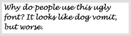
Ugh… Probably the most commonly abused type of typeface, script. (The second would have to be decorative, like our friend Papyrus). For some reason people love the idea of making any writing look handwritten, blatantly disregarding the fact that the design shouldn’t have a personal feel. Sometimes they want it to look fancy, even if the design shouldn’t be fancy or formal. Lucida Handwriting is the most common “hand written look” font that is available by default on most operating systems. The result? Everyone uses this lousy excuse for a font on EVERYTHING. I can’t tell you how many full fliers of content I have stumbled across that use nothing but this font. The funny thing is, it becomes less legible than most people’s actual handwriting.
How it should die: All copies of this font ever created should be transfered onto DVD’s, which are then melted and mixed into pen ink. They will then be scattered all over the world by someone writing “STOP USING HANDWRITING FONTS” until there is no more ink left.
3. Monotype Corsiva

Sigh…. Somewhere between a handwritten font and a script font, this again pops up everywhere. Seems that anyone who is unsure if their design should be personal, formal, or both… uses this font to make things ugly and painful. Simply looking at this font makes my eyes sting, as it screams “I want this to look cool, so I picked the ugliest font that actually has letters (I tried wingdings but my boss said no).” Again, of course, the only script-esk font that comes on computers by default. Of course everyone wants to use it because Georgia is just too simple, beautiful, and elegant.
How it should die: Each letter should have its stupid tails broken off, and then left in a desert where it could bleed to death. I don’t know what type blood looks like, but if I had to guess I would figure it was kinda thick and fatty… just fyi.
4. Comic Sans

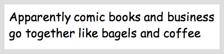
I am sure everyone had to see this one coming. The amount of memos, emails, fliers, and newsletters that are distributed every day completely covered with comic sans is enough to make the average designer vomit. Seems that everyone wants their work to look informal, and somehow comic sans is the font that everyone thinks achieves that. Never mind the fact that it looks unprofessional, is hard to read, and is painfully ugly. Guess what, a simple san-seif font like helvetica will let readers UNDERSTAND THE CONTENT with out having to try and guess why you used an abomination of a font to write in. And since when did anyone decide that comic book style writing was anything we wanted to use anywhere but comic books?
How it should die: The x-men should bust out and demolish all copies of the font. The bonus here is that they would no longer be able to utter any stupid dialog in their books, and there would be no more x-men movies. Hue Jackman would be out of a job and I would no longer have to see him, booyah.
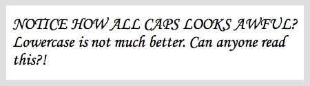
5. Times New Roman

Some people are angry with Microsoft for a whole lot of different reasons. Crappy software, bad business practices, simply making way too much money… I am angry for continuing to keep Times New Roman as the default font for any and every application they have ever created. I will admit, Times is not as bad as most people make it out to be… but it is not great. There are tons of better type faces that come with the OS by default, why not use one of them!? PLEASE, SWITCH THAT STUPID FONT! Think about how much easier reading would become over the entire world. Then I could focus all of my hate for them on how much IE sucks.
How it should die: After banding with all the other versions of Times New Roman, they should storm Microsoft HQ and burn it to the ground. However due to their own stupidity forget to leave as the building perishes, and burn up in the process. The ash should be used as fertilizer to grow something less ugly like weeds.
« Free Mac Project / Time Management Tools 12 websites that slide and scroll with javascript »


COMMENT Brian
I’d add Neutraface. There’s absolutely no font I’m sicker of seeing than Neutraface. I hate seeing it. I hate using it. I hate clients that insist on it.
Times doesn’t bother me. It’s the default, and I have a feeling that the change most people would make would end up being far, far worse. Plus, it’s useful on the web when I’m sick to death of Georgia.
Posted on 04/15 11:34am
COMMENT diogo
Times is a fine typeface. I agree with the others though
Posted on 04/15 12:08pm
COMMENT John
These typefaces are so overused they should be 451′d:
Futura
Copperplate
Herculanum
And I agree with the other commenters. Leave Times out of this.
Posted on 04/15 12:18pm
COMMENT ross
Good responses, Copperplate ughh…
Futura, Nutraface, Herculanum tend to be more “designer overused” imo… They are better than most of the crap like Papyrus, but agreed… overused. (Of course I use Futura on my company site, whoops!)
I agree that times is not that bad, but it is not great. I have made at least a few posts to times defense.
Posted on 04/15 12:25pm
COMMENT g
I think SAND should be there. I’ve seen it on EVERYTHING from marketing brochures to Chinese take out. It should be sink and die in the depths of some neverending quicksand.
As for designer overused typefaces:
Gill Sans
Helvetica
Posted on 04/15 1:02pm
COMMENT ross
I wasn’t sure what font “Sand” was so I looked it up, and wished I hadn’t. Why anyone would use that for marketing brochures is beyond me.
Posted on 04/15 1:17pm
COMMENT Oskar
Without alternatives this list us useless and ugly.
Posted on 04/15 1:46pm
COMMENT Trevor Davis
I’d have to disagree with Times. Yes, it is the most commonly used font, but it can be used well. Just today, Typesites did a review of the Seed Conference site, which uses Times.
Posted on 04/15 1:47pm
COMMENT Joe Windeknecht
@ g
I must disagree with Gill Sans and Helvetica. These fonts are just… priceless.
For my 2 cents: Zapfino. To me that says, “Hey guys, I just got a Mac!”
Posted on 04/15 2:02pm
COMMENT existdissolve
Have you ever had a $7 bottle of whiskey? Never throw that stuff away!
Posted on 04/15 2:03pm
COMMENT ross
@Oskar
No good way to give alternatives with out knowing the exact situation that you will be using the typeface for. The problem with so many of these typefaces is that they are used in inappropriate situations (well, some of them are just horrible).
@Joe - I agree, Zapfino is terribly overused.
@Trevor - For what ever reason Coudal partners seem to love Times, on their own site and the one you mention… they use it everywhere. It is still an akward typeface and there are plenty of good alternatives other than georgia. Not the worst one on the list, and yes part of it is because it is the default typeface. Still not a great typeface.
Posted on 04/15 2:10pm
COMMENT John Bragg
I have to agree that without alternatives, this post is simply whining. Saying they are “over”-used is something I could agree with, but saying they are just bad faces is a narrow view, and sounds to me like elitism. If any of these faces were appropriate for something I was working on, I would use them. Your point is probably that most people do not use them only appropriately, but you take that point past the limits of reason.
Posted on 04/15 2:18pm
COMMENT ross
@John Bragg - But isn’t whining and elitism fun???? :))
Overused, inappropriate usage, tend to be offenders of both… some of them are just illegible typefaces. I was venting more than anything, but thanks for the feedback.
Posted on 04/15 2:35pm
COMMENT Timothy Long
DO NOT forget Brush Script.
Posted on 04/15 4:17pm
COMMENT Türkische Chat
thanks for the tricks
Posted on 04/15 4:34pm
COMMENT Jeff
I absolutely despise Papyrus. I’m a big Stargate nerd and when they used it for the DVD cover text it sent me nearly apoplectic.
I still get “professional” emails in Comic Sans and every time I want to write back and tell them about it, but I don’t.
Posted on 04/15 4:49pm
COMMENT Rafael Masoni
I think Times New Roman can be used. The others are really detestable.
There are a lot of fonts I hate and that are over/misused, but I don’t have their names by heart.
Posted on 04/15 7:35pm
COMMENT Lysithix
Why does EVERYONE hate on Comic Sans, I see nothing wrong with it, also Times gets annoying but it isn’t a bad font. However System, is horrible, that is probably why it is never used. AT ALL!
Posted on 04/15 8:07pm
COMMENT Justin (Parra)
Copperplate Gothic gets my vote for shitiest font of all time!
Posted on 04/15 8:08pm
COMMENT Paul Walker
Doesn’t the new Microsoft Office change the default font? I thought it was now Constantina…
I wouldn’t have put Times on the list myself, but other than that, a great list. It should probably be noted, however, that these all have (more limited) uses for which they are appropriate. Except one.
Lucida handwriting. It is my least favourite font of all. There are a few times where a ‘hand-written look’ might be appropriate, most of these being ‘type as texture’ scenarios. Even in those cases, Lucida handwriting is a bad choice. It’s not very legible, it looks ugly, and it doesn’t look like real handwriting. Better to write the message yourself and scan it in.
Of course then there are the people who set entire documents in it, but there’s no point in trying to teach them.
Posted on 04/15 9:11pm
COMMENT maratz.com » Blog Archive » Don’t blame the fonts, blame the designers
[...] 5 FONTS I WISH WOULD DIE. Reading that blog post was extremely sad to me. [...]
Posted on 04/15 9:25pm
COMMENT Noah
Times can still be used to make some beautiful pages. The Seed conference in Chicago for example:
http://www.seedconference.com
Posted on 04/15 10:06pm
COMMENT mahalie
DITTO COPPERPLATE 5 MILLION TIMES - die, die!!!! So over used.
Also, that damn Jokerman font. Don’t know it? Oh trust me, you DO!
Colonna - not abused to often, but when it is, oh my….
Helvetica is a brilliant font but I agree, overused.
Posted on 04/15 10:39pm
COMMENT ross
Wow, much hate for Copperplate. I considered putting it in the post instead of times, but switched at the last minute. Seems that was a mistake as everyone is mentioning copperplate and defending good ole’ times.
I think I first became frustrated with copperplate when I saw it used for every sign at a Ski Resort in Utah. How copperplate fit their branding I have no idea…
Posted on 04/15 10:54pm
COMMENT fwolf
the first four ones: yeah, truely. But Times New Roman?? Looks like you either got VERY SHARP eyes or dont do the reading of manuals too often.
Arial and other rounded fonts are a total crapper if you have to endure them for more than 10 pages aka screens. The clear advantage of serifed fonts is, that your eye can get a hold on them, whilest the
On the web, Arial + Co. are IMNSHO only (over)used, because Times (or Bitstream Vera Serif in my case) is the default set font in every browsing application world-wide. Also, architects, graphic designers and other folks that tend to think reading should be also totally styled up, like to see them roundy crap around a lot.
Let’s try a test: Print a copy of Lord of the Rings (the complete works in one book) in Arial or even better, Verdana and start reading it. I bet with you: Your future oculist is going to have a huge increase of his salary after you’ve been finished with reading
cu, w0lf.
Posted on 04/16 1:12am
COMMENT Ivan
“I am angry for continuing to keep Times New Roman as the default font for any and every application they have ever created.”
AFAIK, Office 2007 has Calibri as its default font
Posted on 04/16 7:57am
COMMENT Web Design Lincolnshire
When an amateur web designer uses these fonts. This shouts lot cheap.
Posted on 04/16 8:09am
COMMENT ross
@fwolf - The fact that times is simply a serif font is hardly justification for its worthwhileness. There are plenty of very elegant and legible typefaces that are of much higher quality than times.
Let’s try a test: Print a copy of Lord of the Rings (the complete works in one book) in Arial or even better, Verdana and start reading it. I bet with you: Your future oculist is going to have a huge increase of his salary after you’ve been finished with reading
Verdana was a font specifically designed for screens before anti-aliasing was widely available. I am not sure why anyone would suggest using it for a print?
There are situations to use a serif font and a san-serif font, but that doesn’t mean ANY of the two.
Posted on 04/16 8:21am
COMMENT Nora
In the olden days, before the computer, we were treated to dollops and dollops of poorly applied vinyl type in a limited selection of faces. Horrid at the time, it has now become trendy to imitate the lo-tech junky look.
I wonder if designers of the future will interpret Lucinda Grand and Chalkboard that way.
Times… the cr*ppy cut that comes free with your pc — yes it does stink. But higher quality versions can be had, and used with restraint can be perfectly appropriate for a number of purposes, albeit, most better met by Minion or Janson.
Posted on 04/16 11:55am
COMMENT Dennis at Web Axe
I thought we weren’t doing lists any more, ha ha (see Twitters). I actually dig Papyrus, but I don’t imagine when I would actually use it!
Posted on 04/16 3:11pm
COMMENT Rose / Intergalactic Hussy
I concur! Especially times, it’s the worst default font ever! lol I would also add courier new but since its a screenplay font (for some reason), it does serve a purpose I suppose.
Posted on 04/16 3:12pm
COMMENT Kit Grose
While for the most part I concur, I’m not sure people should accept typographic advice from someone who would letterspace lowercase.
Gill Sans has been lovingly kerned by professional typographers; who are you to put 2px between each letter?
Posted on 04/16 10:09pm
COMMENT ross
Not sure where you see letterspaced lowercase elements. There were a few headlines that were lowercase (css specificity error, thanks for pointing that out!) but those also had no letterspacing.
But if you don’t want to take my advice feel free to use comic sans on all your e-mails, I won’t mind. I promise
Posted on 04/16 10:29pm
COMMENT Jonathan Sells
I was just thinking the same thing ;P Papyrus in partcular, why the hell is this font even invented? It’s a homely font that I too wish would die.
Posted on 04/17 1:38am
COMMENT Joris
Good stuff
Posted on 04/17 2:58am
COMMENT Tipos de letra que quitaría de en medio » Cosas sencillas
[...] unos dÃas leà el artÃculo 5 fonts I wish would die, que estoy completamente de acuerdo con lo que expone, asà que inspirándome en esa lÃnea, me [...]
Posted on 04/17 6:54am
COMMENT Jason Marsh - Website Designer
For most part I must agree, all tough my design style leans more towards modern contemporary, Times could be still be used to pull off a smart corporate design with style.
Posted on 04/17 11:50am
COMMENT Michael
I see Neuropol everywhere and hate it. It’s like Science Fiction 101, or so people think.
Posted on 04/17 6:48pm
COMMENT Michael
You forgot Neuropol
Posted on 04/17 6:49pm
COMMENT Testimonials | Jono Fisher - Photographer
[...] deciding whether or not to shoot with you? — Being married to a designer, you get to see a lot of this kind of stuff. I agree, Papyrus must go, Times can stay (except in print ads). — These guys have a [...]
Posted on 04/18 5:40pm
COMMENT tripdragon
You Fail the internets son. Instant Fail
Posted on 04/19 11:41am
COMMENT Valontuoja » Blog Archive » Kaoottinen linkkidumppi
[...] » 5 fonts I wish would die - Web Design Marketing Podcast & Blog [...]
Posted on 04/19 4:39pm
COMMENT Alt
You know guys, which one is missing? Algerian Font .. this font is everywhere and I hate it cause novice designer use a lot mostly it’s first font on your font list.
Alt
Posted on 04/21 9:24am
COMMENT Aleksandar
So, you hate fonts. Is Comic Sans a problem because it’s by idiots outside its intended place (Microsoft Bob’s program)?
Or when Papyrus is used outside its intended use: “Costello described his goal as a font that would represent what English vernacular would have looked like if written on papyrus 2000 years ago.”
What you actually hate are idiots that misuse the fonts. And that’s a different matter.
Leave the fonts be - each has his use and place.
Posted on 04/22 3:58am
COMMENT 5 fuentes desagradables — Tablosign
[...] 3.7 hicieron una lista de las fuentes que son desagradables y que particularmente en autor desearÃa que no existieran. No podÃa faltar Comic Sans, claro que [...]
Posted on 04/22 10:16am
COMMENT Typo Inspiration: Times New Roman « lab111 — Blog
[...] Wer sagt, dass die Schriftart “Times New Roman” hässlich aussieht? [...]
Posted on 04/22 11:25am
COMMENT Melissa
I agree with Aleksandar. Each font has it’s use, even if it’s purpose has become buggin people because it’s so widely over-used!
Posted on 04/24 2:47pm
COMMENT A Plea From 16 Most Overused Fonts » Inspiration Bit
[...] 5 Fonts I wish Would Die [...]
Posted on 05/01 4:29am
COMMENT CQMarketing
Agree with you on Times and despite all the “bad typefaces” out there, I’m still miffed there are only 5-6 fonts which can be used on websites and Times is one of them! Ugh
Posted on 05/02 4:54pm
COMMENT mistersocks
Sorry, Mistral is the worst font of all time. Used for the Sandals resort logo and every nail salon sign in the world.
Posted on 05/07 5:13pm
COMMENT Annie
I HATE HOBO
Posted on 05/12 4:49pm
COMMENT Karen
word to your mother!
Posted on 05/17 12:04am
COMMENT Chloe and Rebecca
I dislike you and your sarcastic tone, I think you should be the one to die.
Your tone creates a know-it-all impression. Have YOU ever made a font of your own? I very much doubt it, dear. The wide selection available is available simply becase loosers like you can not put up with some unwanted fonts.
Why make a blog out of this, I ask? Just don’t use them.
No need to tell the world of your mental problems, really, is there?
Oh yes, and I dislike the fonts you have used on your website.
(very much)
Thankyou.
Posted on 05/18 4:29am
COMMENT barbtastic
http://www.iheartpapyrus.com/
Posted on 05/20 10:10am
COMMENT sarah stengle
I once encountered a author of a book on Graphic design who wanted to set his entire book in COMIC SANS!!
I was appalled. It is one thing for novice to make a misguided effort to make something look “Friendly” by using a dorky font. But for a book on Graphic design by a self proclaimed expert! yeeesh. Thankfully, this inconceivably bad choice was nixed by the publisher.
Seeing this little web posting made me smile. Most people don’t understand even bothering to hate a font. But when real beauty is widely available, there is just no excuse for “Papyrus”. etc..
My other pet peeve is digital small caps, instead of real small caps. I say don’t even bother unless you go for the real thing.
Posted on 05/21 11:27pm
COMMENT Instant Letter Writing Kit. | 7Wins.eu
[...] » Blog Archive » The Long-Distance Relationship Goal Setting Toolkit | Success Begins Today » 5 fonts I wish would die - Web Design Marketing Podcast & Blog Tags letter of recommendation sample cover letter business letter letter writing cover letter [...]
Posted on 06/10 7:19pm
COMMENT Jurobei
I’ve got one, although it’s not doesn’t really pertain to business. Trajan. Seriously, Hollywood needs some more imagination. Although, it’s been lacking on that for quite some time.
Posted on 06/24 3:36pm
COMMENT Chester
I happen to like Comic Sans actually.. its not that bad of a font if you are wanting to write friends or relatives you know, or just typing an unimportant article on the internet. Its a cutesy font, and therefore i shall protect its dignity!
My 2 favorite fonts though, would be ‘Andes’ and ‘Solid Antique Roman’… gotta love Bioshock and Gilmore Girls! >:D
Posted on 07/09 9:55pm
COMMENT Diane Schwartz
I’m glad I got to this site. Very funny commentary on different fonts! I was looking for Nutraface (requested by a client) and found Neutraface. OMG, I do not like it! I hope I can talk them out of it. I agree with your take on all the fonts. Times is okay in certain applications. I did change my default font from Times New Roman to Times. I have severe issues with pdf files if I accidentally use Times New Roman. To me, the worst typeface of all is Arial!
Posted on 10/02 10:14am
COMMENT Joanne Fairbrother
I agree! We are all bored to death with them. Perhaps once upon a time, long, long ago they may have been mildy interesting. However, sadly many many non-designers have abused them, and here we are today. My 2 cents…
Posted on 10/29 4:29pm
COMMENT Santahn
I would add Copperplate.
Posted on 11/27 6:15pm
COMMENT majorflux
great, critizing good old times font but doing the web layout with white type and dark grey background… how good is that?
Posted on 12/15 1:40pm
COMMENT ugbash
I hate your list.
Posted on 12/26 5:39am
COMMENT another designer
I would have to agree with majorflux… white text on a dark background is far worse than any combination of the aforementioned fonts.
Posted on 12/26 12:39pm
COMMENT Kevin Tong
I totally agree with everything you said. I hate comic sans so much. Also, the Chinese take out font. Let’s keep fighting the good fight.
Posted on 12/28 9:56am
COMMENT Andy
Many comments tell the truth, these fonts are misused, not bad to begin with. There’s hardly any solid facts in your bashing, it just makes you sound like a tool.
Posted on 01/08 9:27pm
COMMENT Dan Richards
Ahhh “Andy”….
But anonymous bashing on a blog that, from what I can tell was tongue in cheek is somehow less tool-ish?
Posted on 01/08 10:46pm